Ballard Food Bank Gets a Fresh Look
We are so excited to be opening our doors to the new Ballard Food Bank in mid-October. We cannot wait to welcome all of you into our future home!
Our new home will be nearly twice the size and we have exciting plans for what we’ll be able to offer in the new space. This expansion and move make this the perfect time to debut a colorful, new brand to match the spirit of our organization. This brand reflects who we are, how we serve people, and what that means for the community. It will infuse our fantastic new home. You will also start to see it on our website, social media, and newsletters in the coming days and weeks.
I want to take this opportunity to tell you about the brand and why we think it’s a perfect fit for who we are and where we’re headed.

A brand has several elements—visuals and language—that are firmly attached to our work and our values. It took months of work and reflection to create this new brand, and we asked for feedback from clients, volunteers, staff, and supporters at key points in the process. We were so inspired that people took time to share their thoughts and insights with us—it shows how much our community cares about Ballard Food Bank.
First of all, our neighbors know and love us as Ballard Food Bank so our name will stay the same. We will continue to provide the critical services that many members of our community depend on. These include nutritious food for pick-up, Weekend Food for Kids through our school partners, home delivery for our neighbors who cannot visit the food bank, an extensive selection of hygiene items, and no-cook items for our unhoused neighbors, as well as financial assistance and mail services.
We have added the tagline “a hub for hope” to our name. This describes what our community will experience in the new building. It also captures the spirit of our entire organization—a sense of belonging, warmth, and openness.
Once safety protocols allow, clients will be able to explore Ballard Food Bank and choose items—just like in a grocery store. But food is just the beginning. With our hub partners, we will provide a range of services including medical and veterinary care, public transit passes, housing help, access to IDs, and much more. Clients will be able to get everything under one roof in a comfortable and dignified setting.
Our new home will also be a place where the entire community can come together. Our Kindness Café will encourage people to sit together, talk, and find common ground over coffee or a sandwich. Everyone will be welcome.

Our future home will be a true hub for hope. We aim to be a place that brings inspiration to clients, volunteers, our staff, and everyone who walks through our doors.
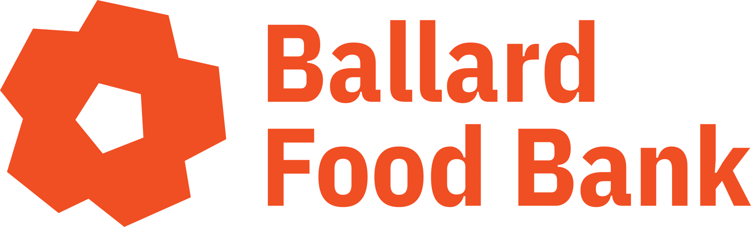
The visual part of our brand reflects this same spirit. The figure at the center of our logo feels welcoming, optimistic, and hopeful. I imagine it as either a sunburst spreading warmth or a hub that brings in people and creates energy. Everyone belongs at Ballard Food Bank and we want our visual identity to convey that sense of belonging.

This figure has concave and convex shapes. The indentations symbolize everyone in our diverse and dynamic community who makes Ballard Food Bank the great organization that we are. The shapes reaching out represent everything that’s available under our roof: food, health, well-being, financial assistance, and above all, a sense of dignity and connectedness.
This shape also looks a bit like a flower. We like the idea of a flower that’s growing and blooming in a part of our city that’s also growing and becoming more diverse and beautiful.
This main figure is complemented by a series of illustrations of the different food items and services—from a quart of milk to hygiene items to housing—that community members can find at Ballard Food Bank. You will see these illustrations throughout our future home. They will help navigate visitors, plus they look beautiful and modern in our new space.

In addition, you will see some new colors in our building, as well as on our website and in marketing materials. We will continue to use the orange and blue that many of us know and love from our Big Blue Building on Leary Avenue. But you’ll also notice colors like gold and salmon pink that brighten up our brand.
At Ballard Food Bank, we tackle big challenges like poverty, hunger, and unjust systems that have left people living on the margins. We can only make progress against these challenges if we come together as neighbors and do this critical work. I am so thankful to the many community members—staff, volunteers, clients, and supporters—who have already come together to make our dream of a bigger, better Ballard Food Bank possible. We need to keep up this great, community-led work in the months and years to come.
That’s why it’s so important that everyone feels welcome in our new home. We want it to be an open, accessible, and friendly place—where everyone feels like they belong. Our new brand will help us get there. We hope you agree.
With gratitude,
Jen Muzia
Executive Director